A bunch of my friends and I are participating in one of those things where you walk around and somehow it cures a disease. I’ve never been the biggest fan of these (I’d rather just donate money than have some sort of gimmick), but if that’s what it takes to get people to donate, then I’m for it. Plus I’m sure those who have a closer personal connection to the cause get something out of it.
Anyway, as I was signing up, I was reminded of my previous post: Wysz hates charities! The registration process was confusing and long, and if I hadn’t already committed to my friends, it’s something I honestly would probably have given up on if I was just doing it on my own. (I’d still donate, just not participate.)
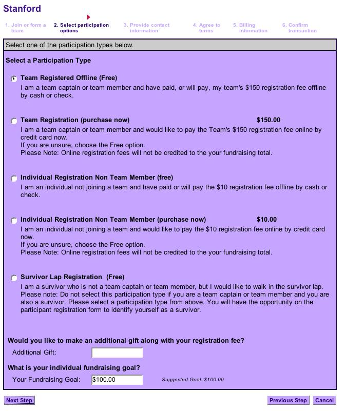
Here’s the first page I had to deal with, which confused me:

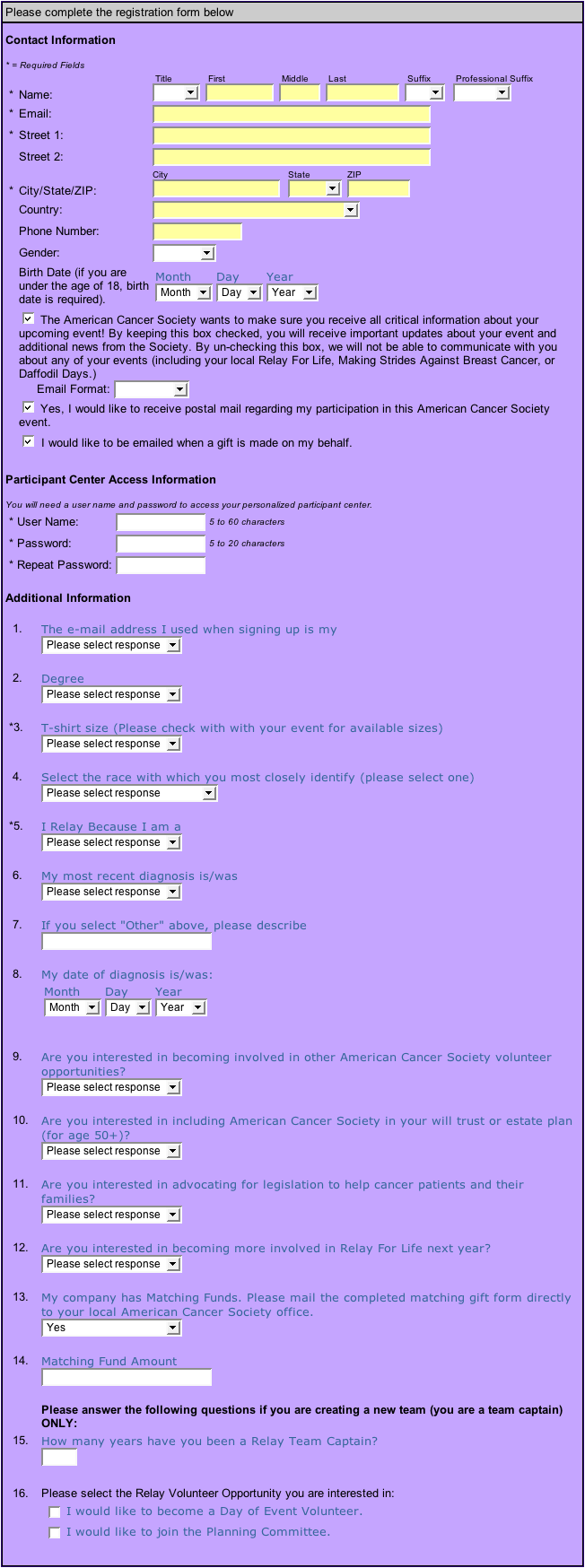
Then, I saw this form, which filled my vertical 24″ monitor:

I finally got through it (with help). You can help me reach my goal by donating here. If I’ve met my goal, help out Koklynn, Charlene, Reid, or Nelson. And as I already had to specify earlier today, it’s not for cancer, it’s against it. While you have your credit card out, you could also help to fight Alzheimer’s. It’s an easy form.
This is one of the most common usability mistakes that websites make, making the sign up process too long. If they had Google Analytics (or something similar) installed, they could see how many people actually do give up before completing the form.
Would you say that the amount of information they wanted from you was too much, or that the form was too long and the process could have been streamlined?
The amount of required information was reasonable, even though I don’t think registering for an account (with name/password) should really be necessary in this case. It was the long form which bothered me. I’d prefer it if they just asked for the required stuff, and then given me the option to add additional information to my profile after my registration was confirmed.